Studio Polpo
2016
Studio Polpo is a social enterprise architecture practice. They create objects, structures, initiatives and research-led resources that enable social change.
The identity, using the letter ‘P’ for Polpo, is based on the idea that architecture informs environment, and equally, environment informs architecture. Typographically, the letter ‘P’ is made from a ‘stem’ and a ‘bowl’. The structural ‘stem’ of the ‘P’ represents architecture, and the ‘bowl’ to complete the ‘P’ represents environment. Both elements work together.
In the same way that Piero Manzoni’s ‘Base of the World’ is a structural base that is completed with an intervention, the logo is completed with interventional graphics.
The logo can be applied to different environments, and different environments can be applied to the logo. Here are some examples:

The stem.

In this case, the ‘P’ for Polpo is completed with a finger print.

Or any cultural reference point.

Using a Bruno Munari Sun.

The moon on a stick.
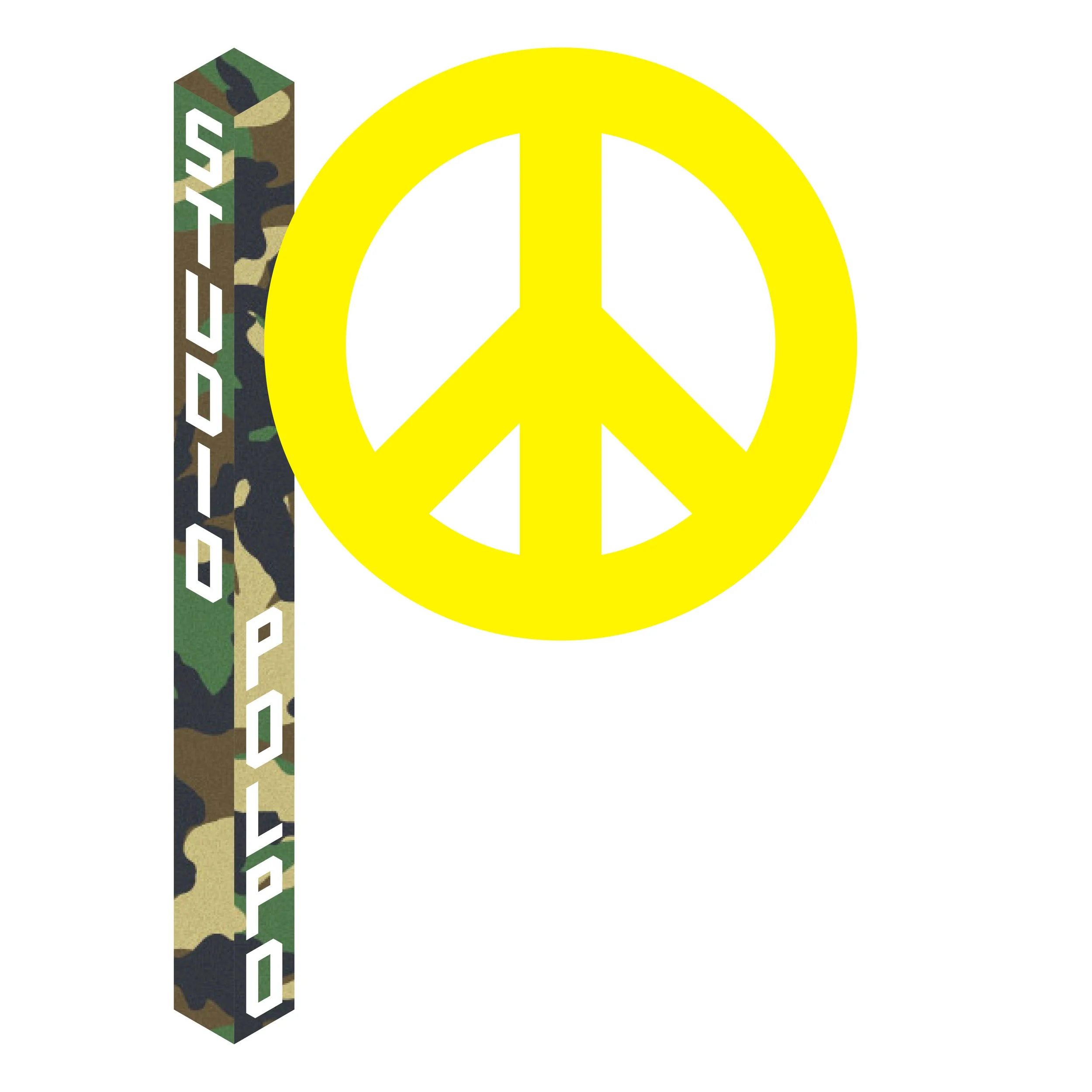
A symbol for peace.

Using Pop Art as Pop Art. (Thanks, Richard Hamilton.)

A pebble.

The world.

Art.
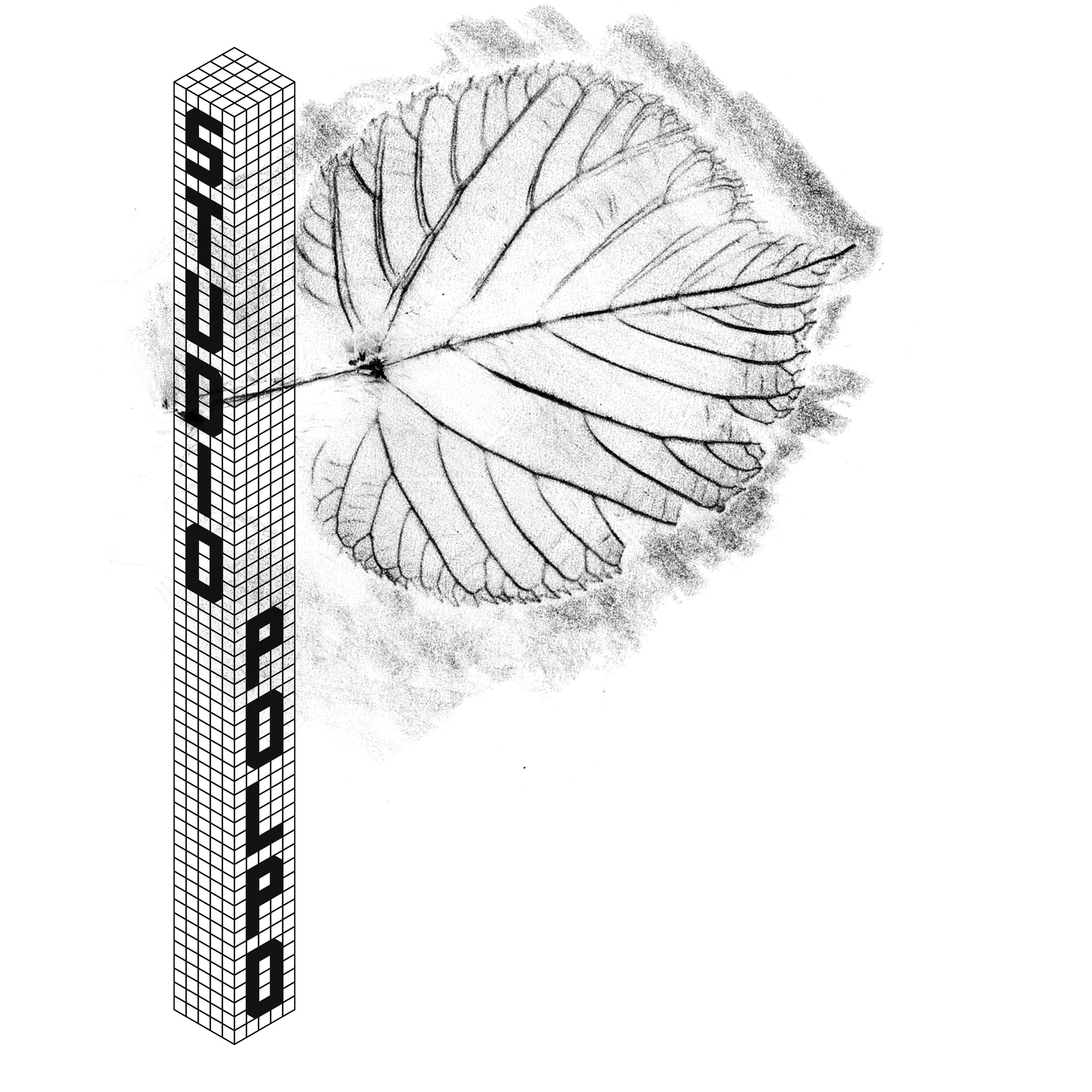
A leaf rubbing.

Science.

A slice of orange.

Politics.

Here the logo is inverted. (Image of Jean (Hans) Arp).